Two Roads Diverged in a Tube Map, and I Took the One Less Followed
- LINCS Project
- March 23, 2022
— Evan Rees, LINCS UX co-op —
The road to UX for me has been long and winding, and I, much like the LINCS users in the Tube Map in Figma, have found myself at various stations along the way, assessing where I should go next. Initially studying Life Sciences at University of Toronto, I made the switch after first year to a specialism in Sociocultural Anthropology. Upon graduation and unsure where to go with my career, I began a Masters of Public and International Affairs at University of Ottawa. I quickly realised that I was too passive by nature to be a diplomat, and I lacked the passion for politics that many in my cohort shared. What I really wanted was something related to my background in Anthropology.
And so, enter UofT’s Faculty of Information. I wanted to study at University of Toronto again, and attended an information session for their Culture and Technology concentration. Because I could attend two sessions the same day, I also attended the one for UXD. In the first five minutes, the professor mentioned that many Anthropology students pursue UXD due to the need for ethnographic skills and interviewing users to assess needs for interfaces. I was sold.
LINCS has been my second placement as a UX specialist. My interest in UX is multifaceted, but in large part I want to be able to contribute to something meaningful by applying my background in humanities and by using empathy to create products that are accessible, diverse, and broad in scope. Working at LINCS has allowed me to do all of these. Creating interfaces for working with Semantic Web means trying to understand how researchers think and feel—and how they want their work to be used. Coming from a humanities background, LINCS has felt like home for me, as it has allowed me to put myself in the user’s shoes more than I had imagined.
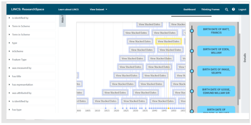
My time at LINCS has been focused on ResearchSpace. I have been looking at ResearchSpace through an analytical, UX lens, finding possible pain points that users will encounter as they navigate through the tool and create the connections between datasets. In determining these pain points, I have taken into account the cohesion of the navigation, the clarity of the language used, the colour scheme as it relates to AODA standards, and whether sections that perform similar tasks could be aggregated.
Working with ResearchSpace, I also created prototype mockups of timelines for viewing events such as births and deaths, creation of artefacts, founding of groups, and so on.

I used Figma to create mockups that pulled together and built upon the best features of other timelines that the team and I had looked at. The best part of this process was seeing prototypes I had created come to life!
I am currently working on creating step-by-step scenarios based on the LINCS Tube Map created by a previous UX co-op, Sana Javeed. This map will help the development team determine LINCS’s ideal users, and will provide the team—and eventually the interface’s users—with a depiction of the pathways as users navigate between the LINCS tools.
Reflecting on my placement at LINCS, I have developed my skills as both a UX designer and as a researcher, learned about the back-end elements of making designs into functioning tools, and benefited from collaborating with a research team. Taken together, all of my experiences are part of working towards a more accessible Web for all researchers to use—and of creating even more roads for researchers to follow.

